Letterboxd Redesign
Improving the user experience of my favorite social film discovery platform
Letterboxd Redesign
Improving the user experience of my favorite social film discovery platform
What is Letterboxd?
Letterboxd is a dynamic social platform for film discovery, allowing users to explore a broad film library, log, rate, and review movies, and build personalized watchlists, all while connecting with passionate cinephiles. It serves as a popular hub for film enthusiasts to interact and share their love of cinema.
Key features include:
- Creating personal watchlists for future viewing.
- Maintaining a film diary of watched movies.
- Curating custom film lists.
- Writing detailed film reviews.
- Reading diverse articles and reviews from critics and users.
Why the Redesign?
As a film enthusiast, I use Letterboxd almost every day and know its strengths and weaknesses like the back of my hand. My goal was to enhance the overall functionality, elevate the outdated user interface and improve the user experience.
With this redesign, I wanted to address the problems that I regularly encounter as an enthusiastic user myself.
Current pain points:
- The visually inefficient layout makes it difficult for users to switch between different sections of the app and often causes them to overlook important functions.
- The lack of a visual hierarchy leads to important information such as movie type, tags, details, sorting options, etc. being overlooked.
- The outdated user interface makes the app unattractive to users, so they don’t spend time with the app.
- The lack of tags, especially for genres, puts the burden of decision making on the user instead of providing them with a set of the most searched options for a choice.
- It is difficult for users to quickly search for a movie based on specific criteria such as date, genre, etc.
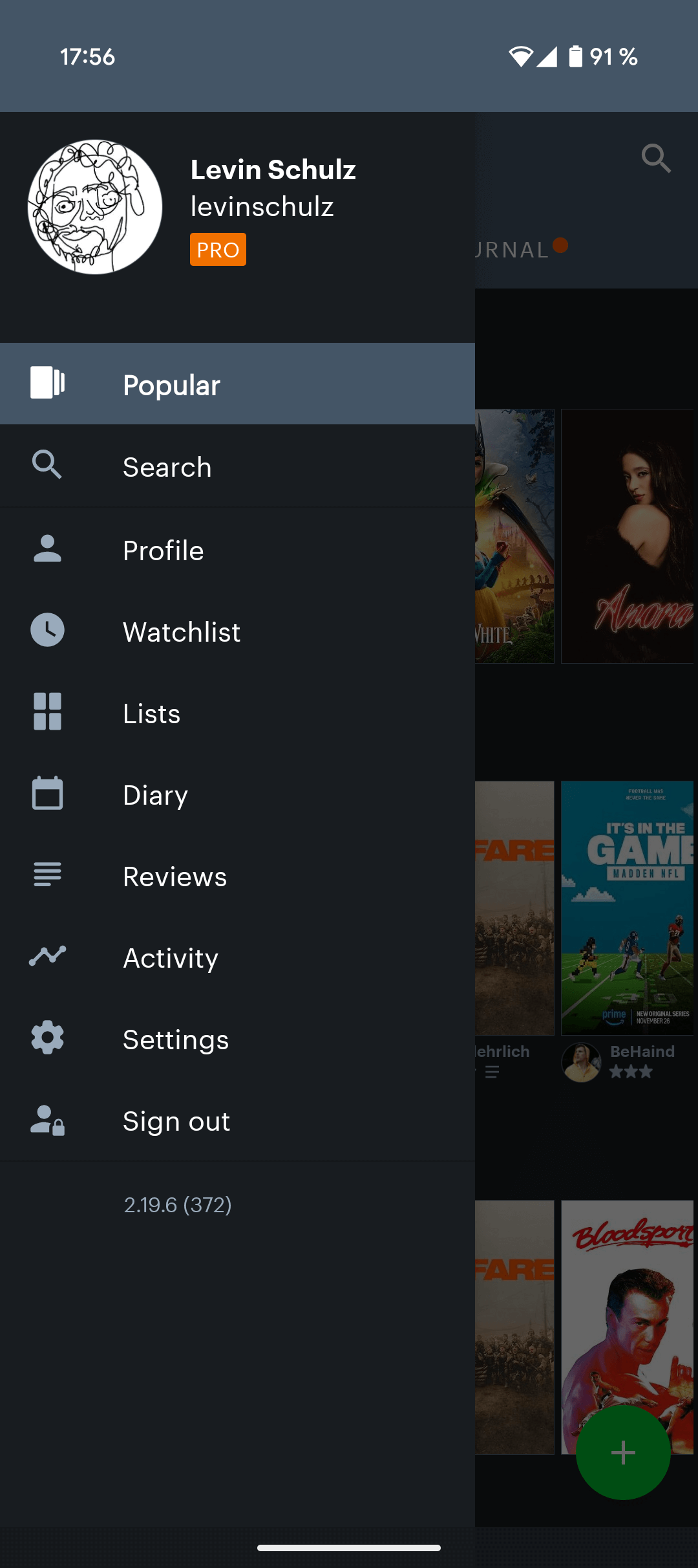
- The most important functions of the app, such as activity (notifications), watchlist, diary, profile and lists, are hidden in a sidebar and therefore inaccessible.
- Although users can log ratings of the movies they like and even add some to the watch list, the current app does not show personalized movie recommendations for active (returning) users.
Research
For the app redesign, I combined personal experience with extensive user research. I analyzed over 23.000 Play Store reviews and collected feedback from social media platforms to pinpoint common user frustrations. This comprehensive approach ensured my redesign effectively addressed the core user pain points.
Some of the most mentioned topics were:
- Absence of a bottom navbar to quickly switch between different sections of the app.
- The complex and confusing user flow that fuels user frustration.
- A lack of personalization and new features.
The UX is in need of optimization. Too many steps to manage your own films/lists. From time to time the app crashes on the app start page. Password and username are not suggested from the saved chrome passwords, 2FA via fingerprint would also be nice. Ergo: to become a pro user this is not yet sufficiently optimized
The content is good, but the app itself is not well developed & maintained. Not very many features and very outdated appearance.
Starting the Design Progress
To address the identified design challenges, I initiated an iterative design process. This involved sketching multiple wireframes, user flow variations and prototyping several screen iterations. This approach allowed me to systematically explore potential solutions and refine the design until the most effective and user-centric outcome was achieved.
A selection of screen iterations and wireframes:


After defining the user flow and information architecture, I focused on a detailed UI design process, ensuring every component contributed to a polished and engaging user experience.
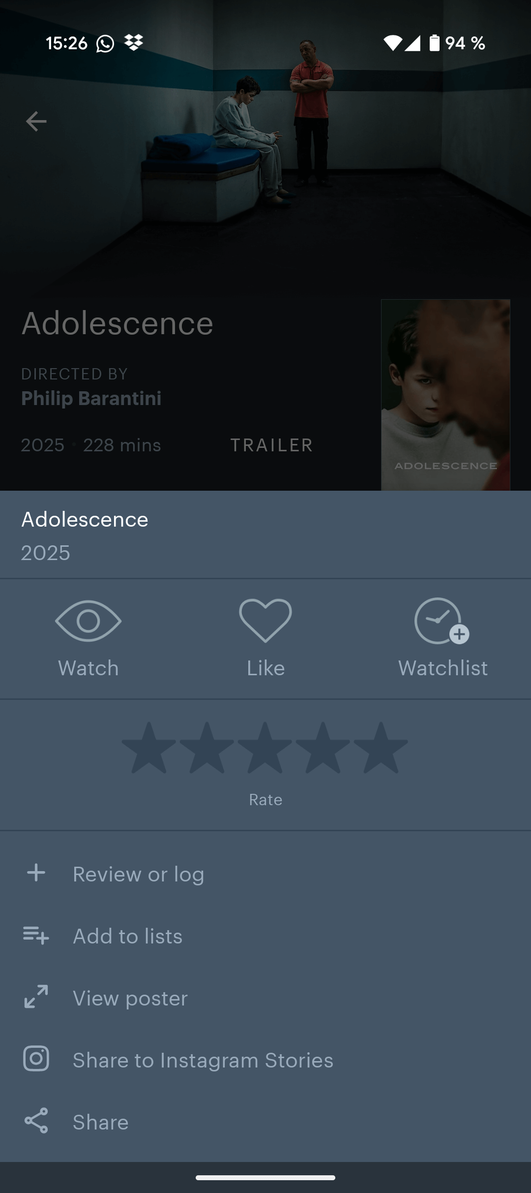
Watch-listing and logging a Movie
Problem: Unnecessary steps for bookmarking or logging a movie
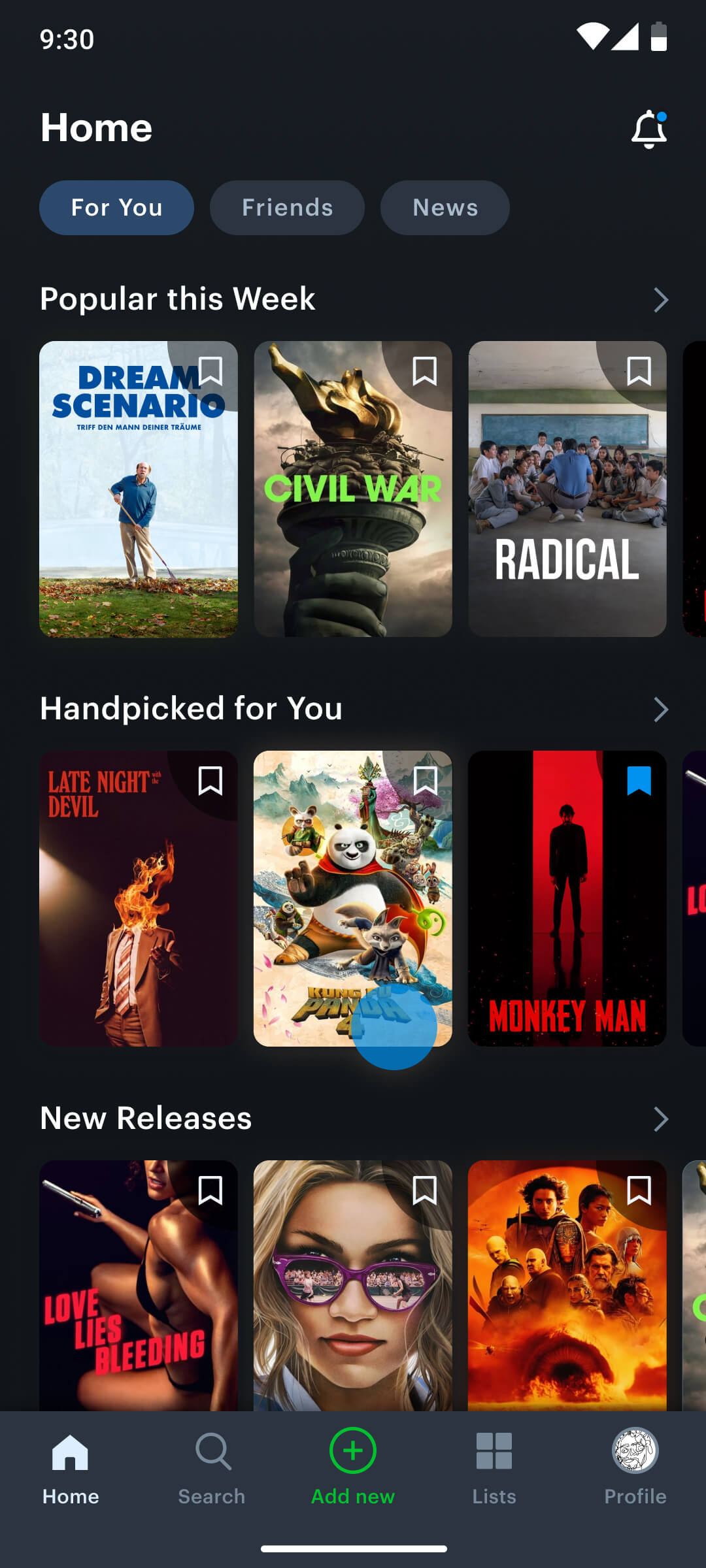
Despite a robust database with millions of movies, the core functionalities of watchlist management and watch logging were hindered by inefficient user flows. Specifically, adding movies to the watchlist required excessive steps, forcing users to navigate to individual movie screens or manually search, rather than providing a direct bookmarking option from the home screen movie cards.
Old user flow of watch-listing or logging a movie
Step 2
Step 3
Step 4
To streamline the watchlist addition process, I implemented a direct bookmark icon overlay on movie posters. This eliminated the need for users to navigate to the movie detail screen, enabling watchlist additions directly from the home screen and reducing the interaction by two taps.
New user flow of watch-listing a movie

Step 2
A new bookmark icon enables users to add a film to their watchlist directly from the home screen.
A new bookmark icon enables users to add a film to their watchlist directly from the home screen
New user flow of logging a movie
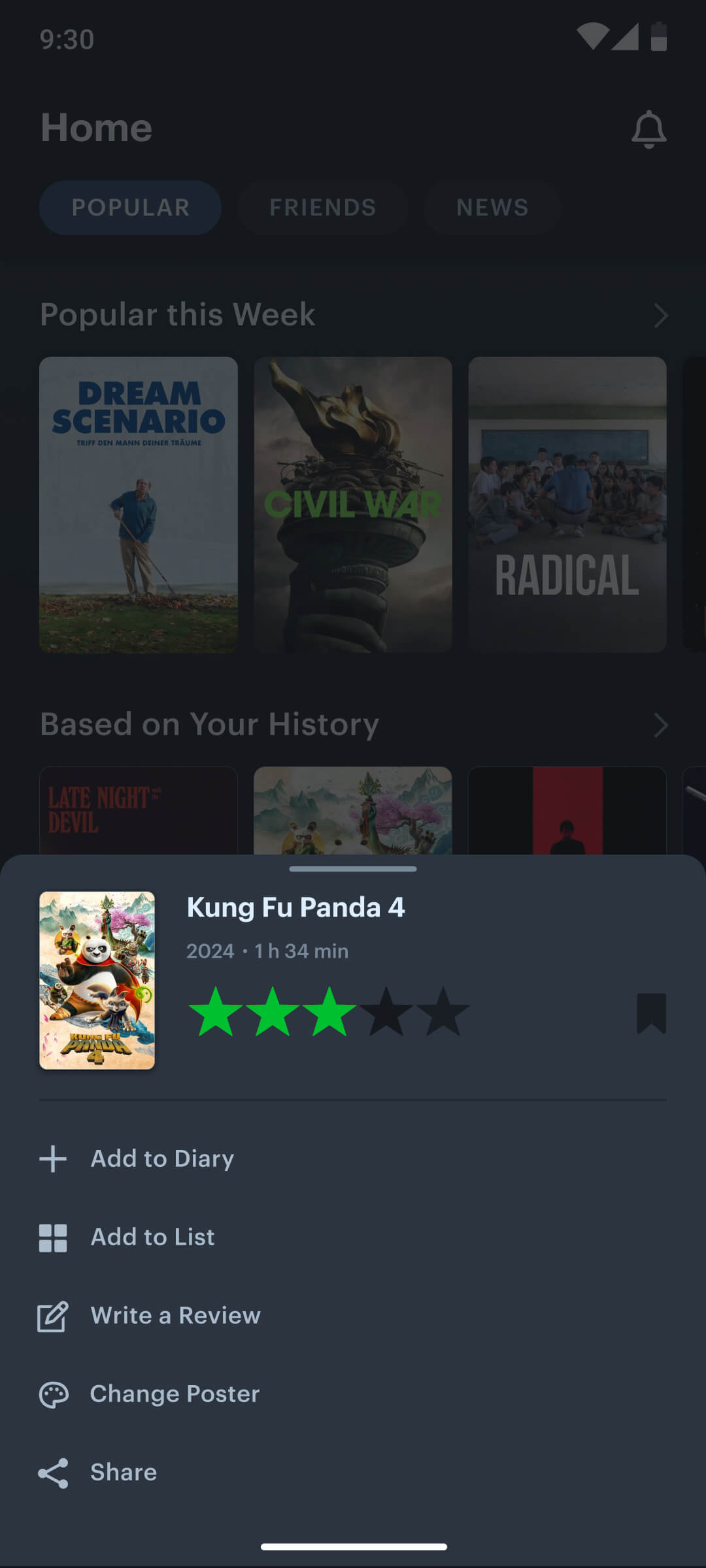
Step 2
A quick menu enables users to rate, watchlist, log, add to diary, review, customize or share a movie by simply long-pressing it.
A quick menu enables users to rate, watchlist, log, add to diary, review, customize or share a movie directly from the home screen
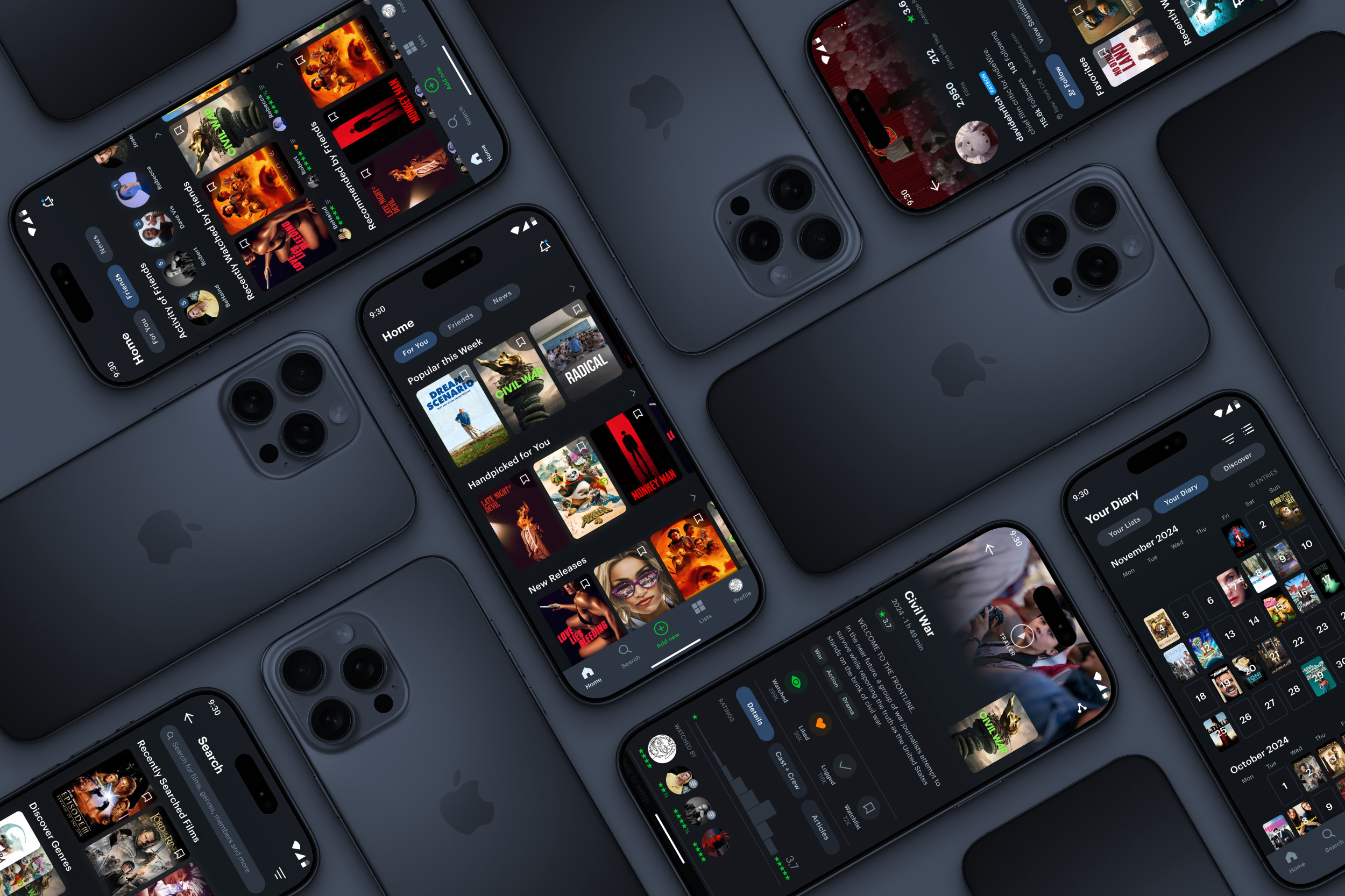
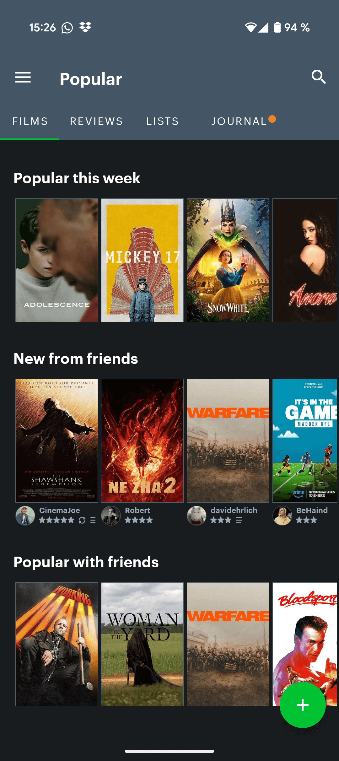
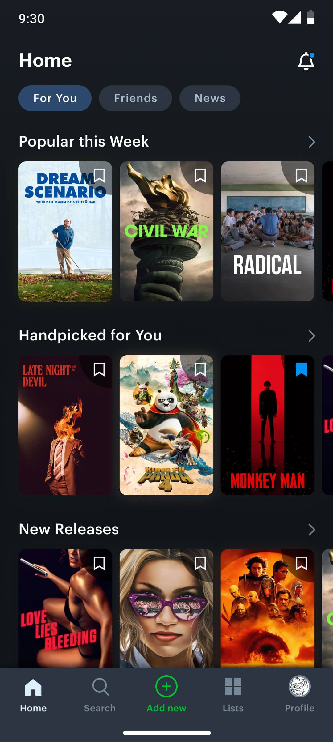
Home Screen
Problem: Outdated, inefficient, and inaccessible UI
As the user’s initial point of interaction, the home screen required a meticulously structured layout to effectively guide exploration and prioritize key information, ensuring a positive first impression.
The purpose of the home screen is:
- To let users discover new movies.
- To let users get personalised recommendations based on their taste and watch history.
- To give users the possibility to explore different sections of the app.
- To easily get information on new activities of friends and critics the user follows.
While the app offered valuable core features, the current layout and uninspiring UI design created barriers to effective navigation and user engagement, limiting its overall potential.
My solutions:
- I introduced a bottom navigation bar for efficient transitions between core features, significantly improving overall navigation.
- I relocated the primary CTA (+) to the navbar, providing easier access and enhancing user interaction.
- I reorganized and combined app sections within the bottom navigation to improve feature discoverability and user flow.
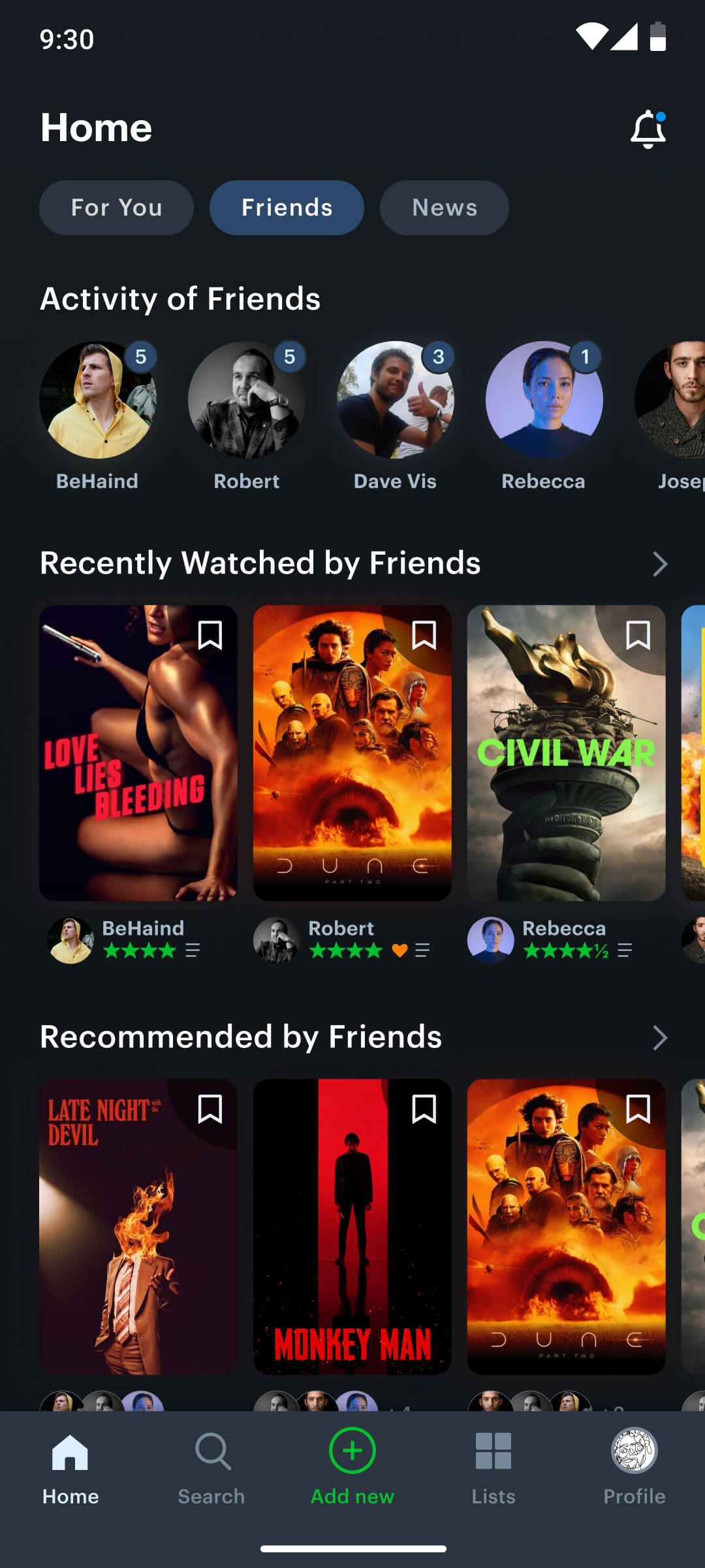
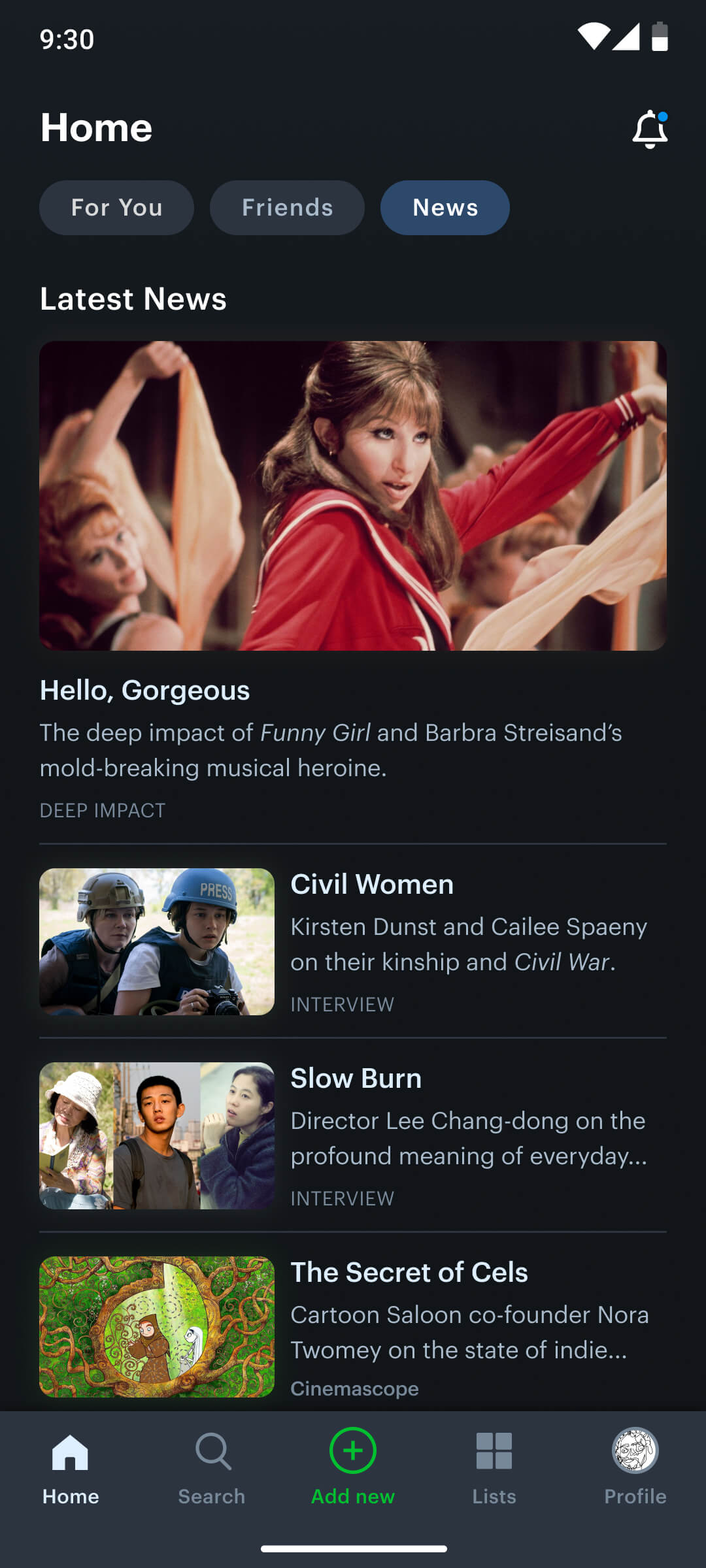
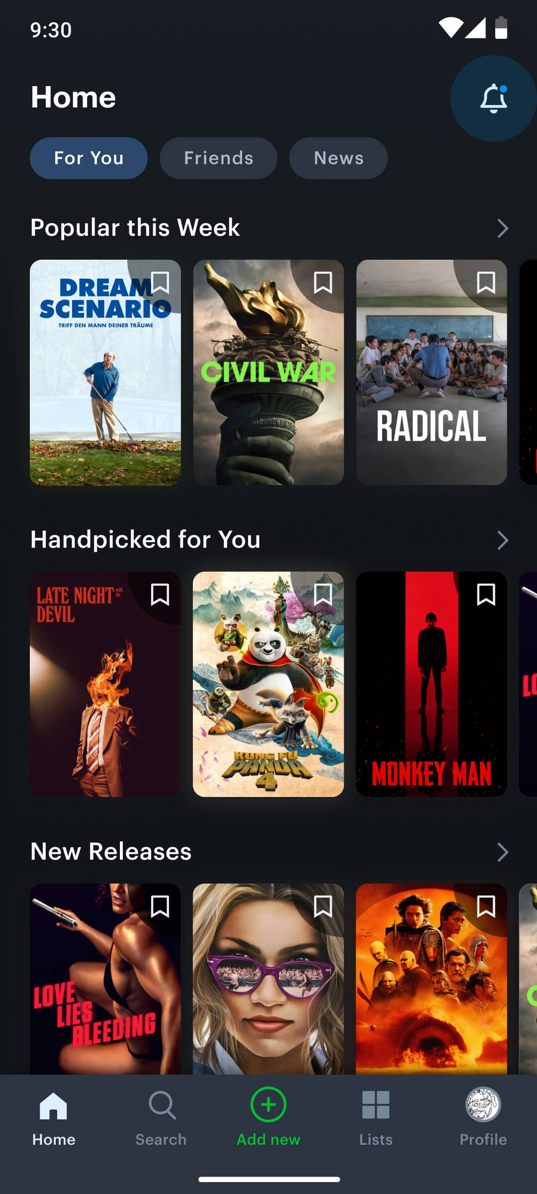
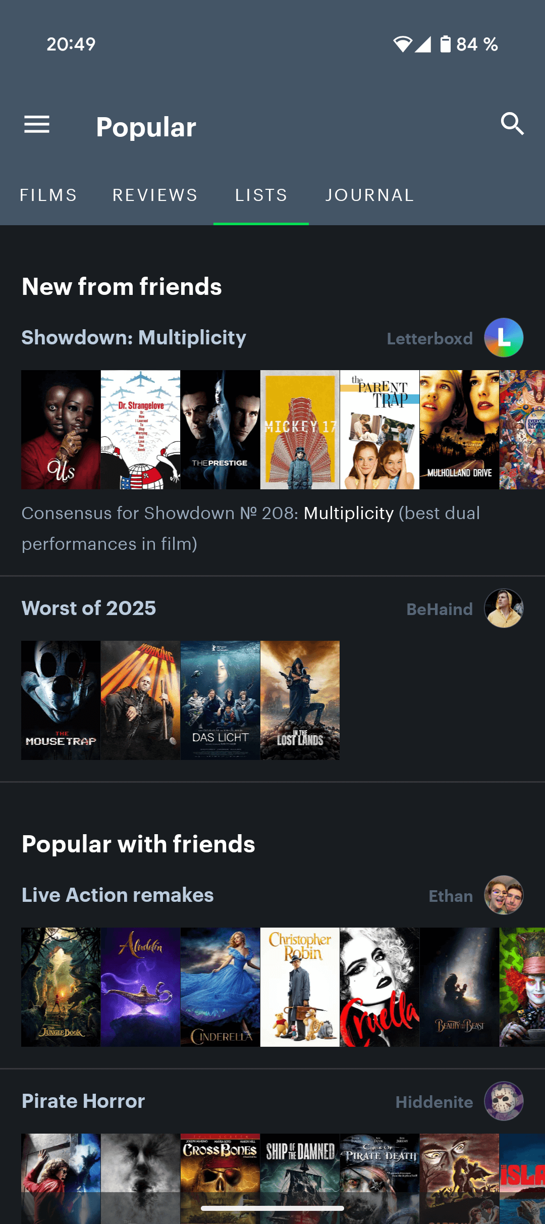
- I organized the home screen into different tabs: The “For You” tab with a personalized feed featuring popular movies, new releases, and “Handpicked for You” recommendations based on user watch history. The “Friends” tab centralizes friend activity and movie recommendations, fostering social engagement. The “News” tab aggregates critic and journalist articles for easy access to editorial content.
Old Home Screen and Navigation
New Home Screen with Bottom Navigation
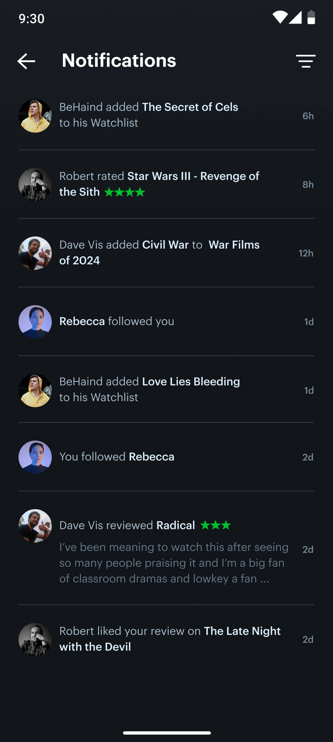
To streamline the activity tab, I combined the sub-sections into a single new “Notification” area, aiming for improved clarity and user comprehension. I removed the “You” section, which displayed the user’s personal activity log, as it duplicated information and detracted from the core notification/activity functionality.
Activities before
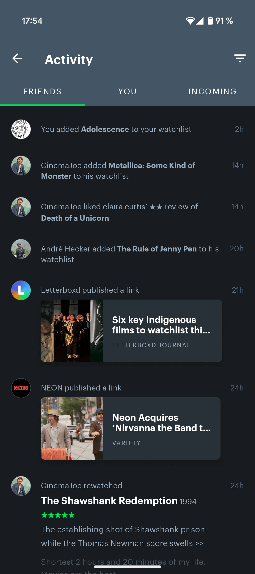
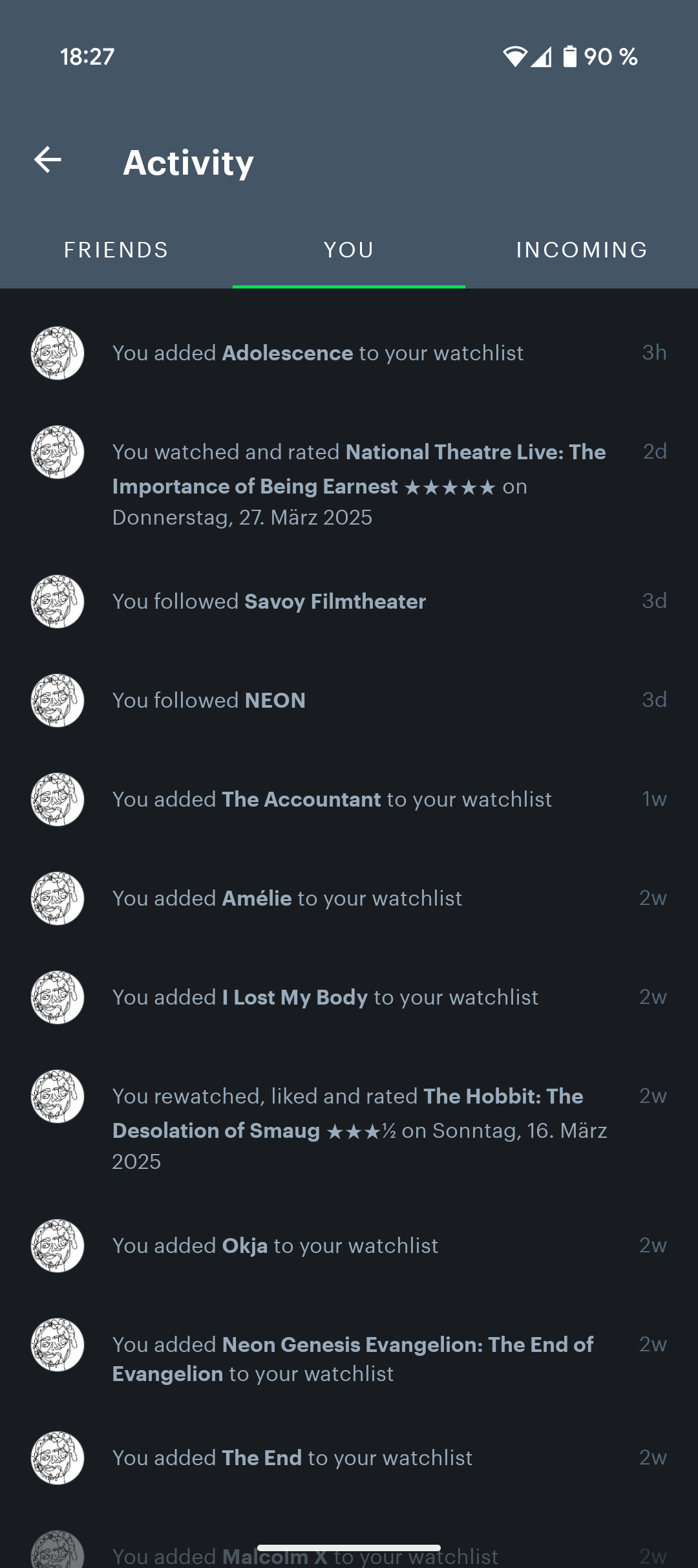
New Notification Area
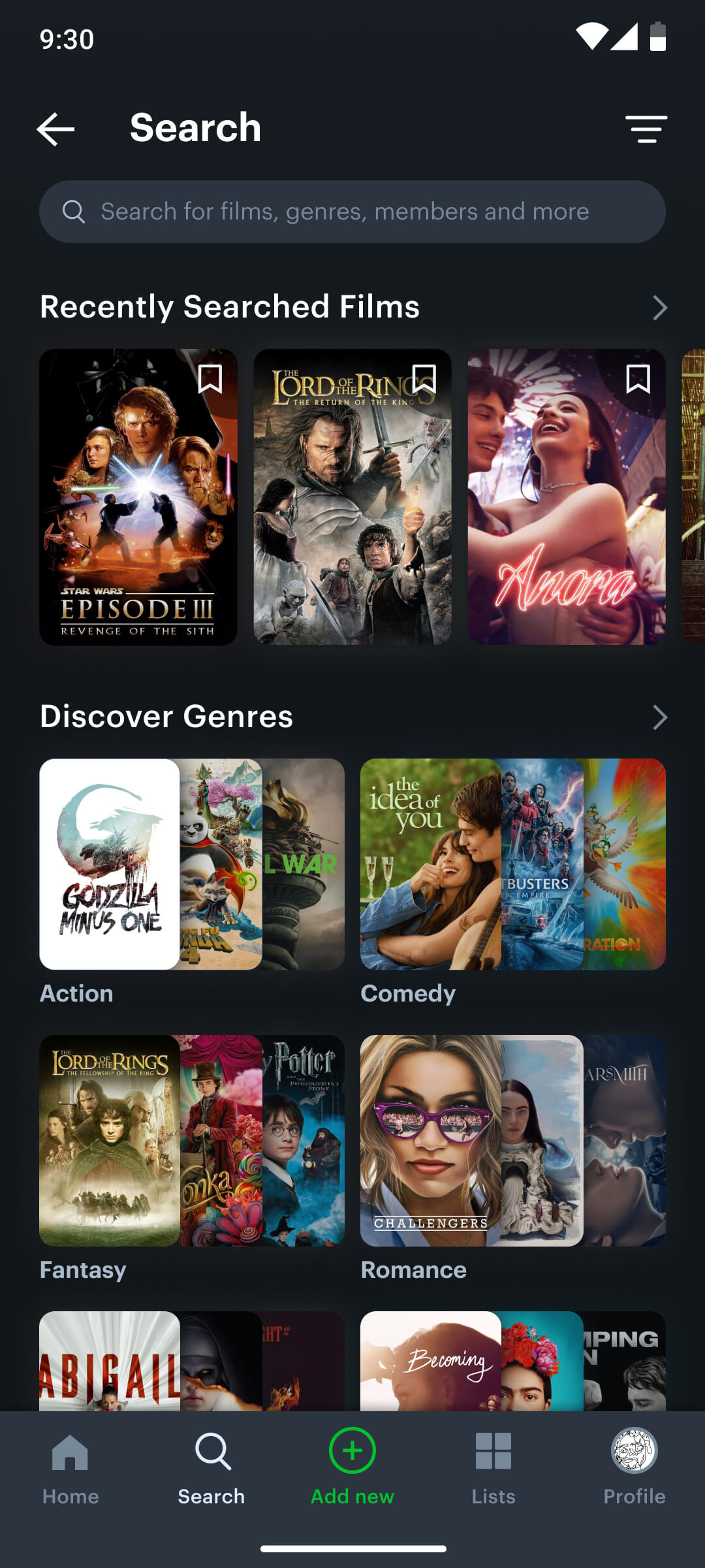
Movie Search
Problem: Lack of search categories for exploration
In the current app version it is only possible to search for films via the title. This makes it impossible for users to discover new films by categories like genres which should be a basic feature for a movie database.
My Solution:
I implemented a search section within the bottom navigation, prioritizing a user-centered search experience. This design enables users to easily access their search history and explore a wide range of genres and subgenres.
Before
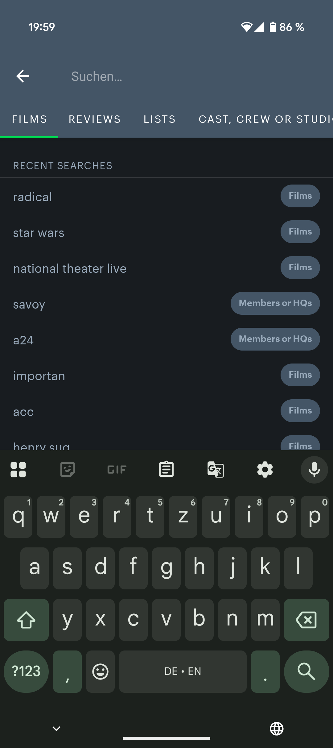
Now
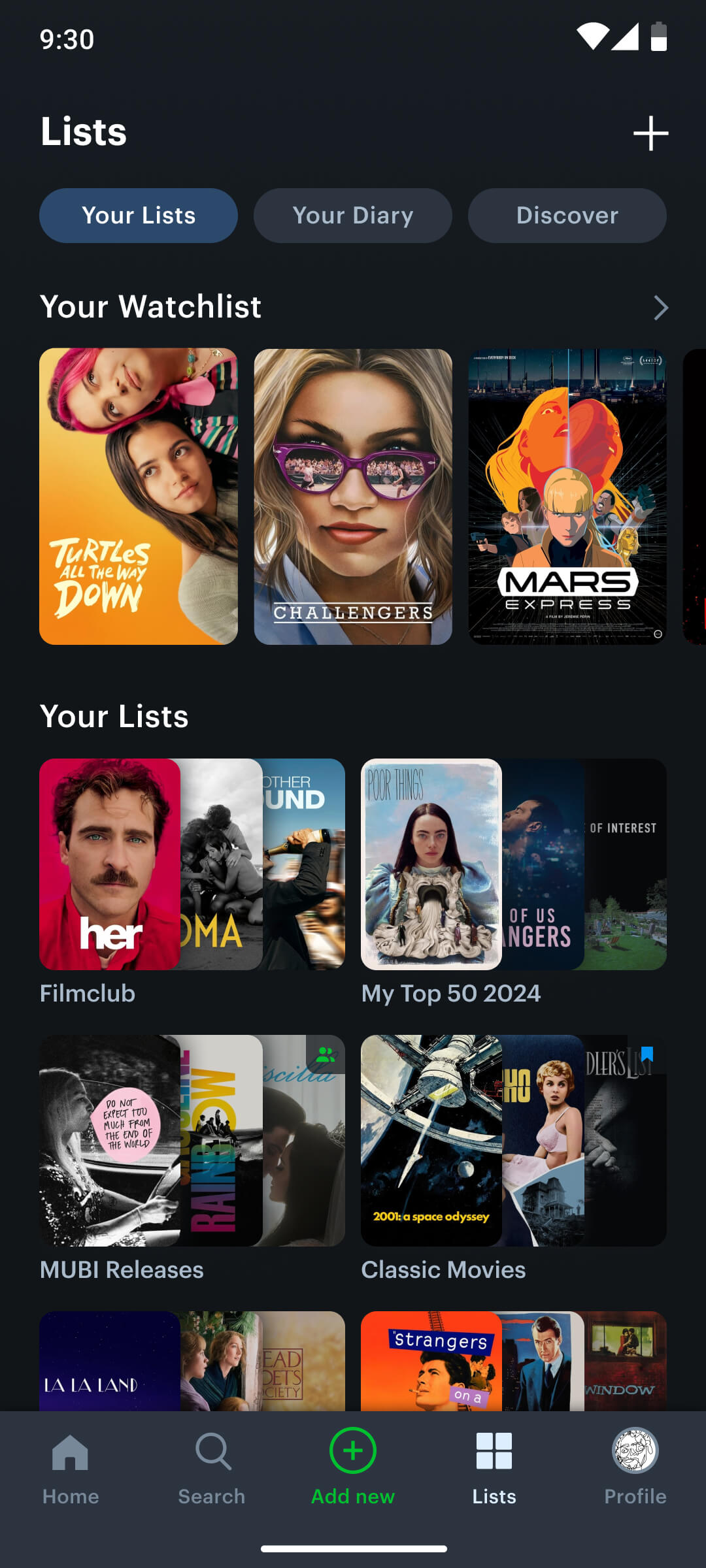
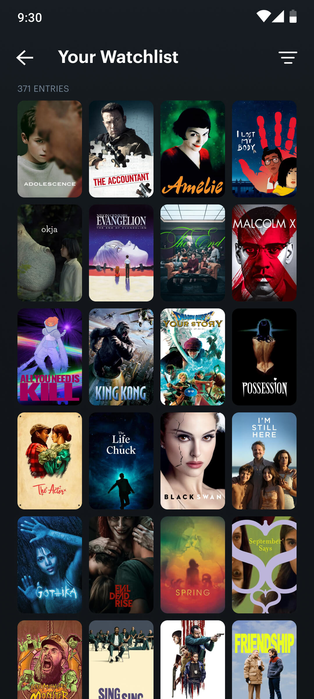
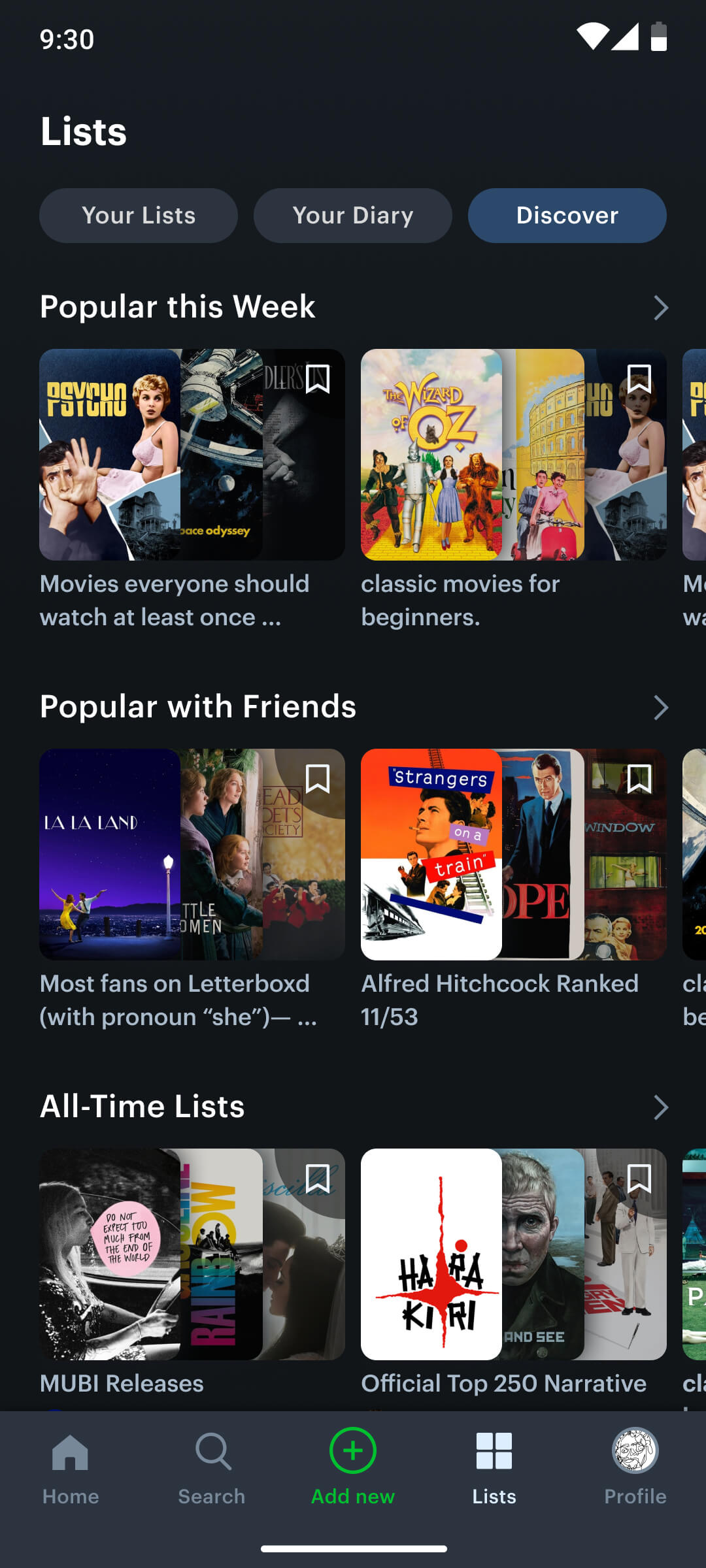
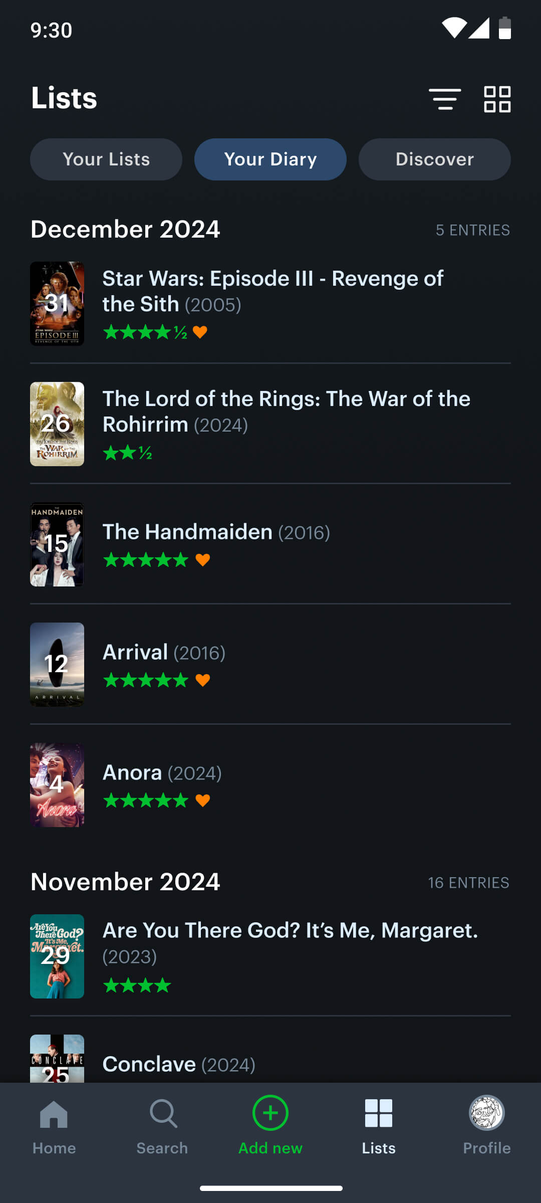
Lists and Watchlist
Problem: Lack of search categories for exploration
A core function of the app—the watchlist for saving movie recommendations—was significantly underutilized due to its placement within a hidden sidebar, failing to provide the visibility required for a primary feature.
In addition to the accessibility problem, the app lacked the essential feature of allowing users to save one of the many curated movie lists.
My Solution:
Recognizing the importance of the watchlist and user-generated lists, I prioritized their placement on the navbar, providing users with efficient, single-tap access to these core features.
Within the newly consolidated section, users can access their saved movies and lists, while also discovering curated lists from the wider community, fostering a sense of engagement and discovery.
Old Watchlist and Lists Section
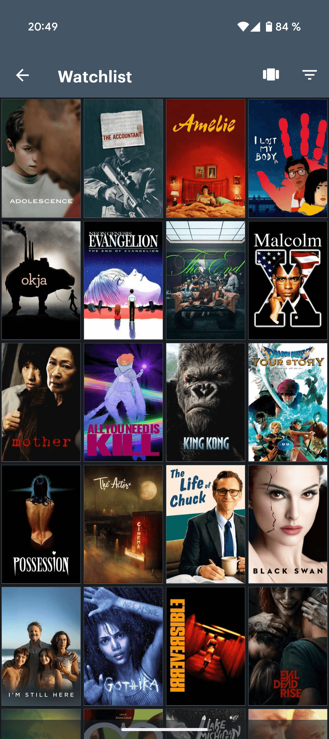
New combined Lists Section
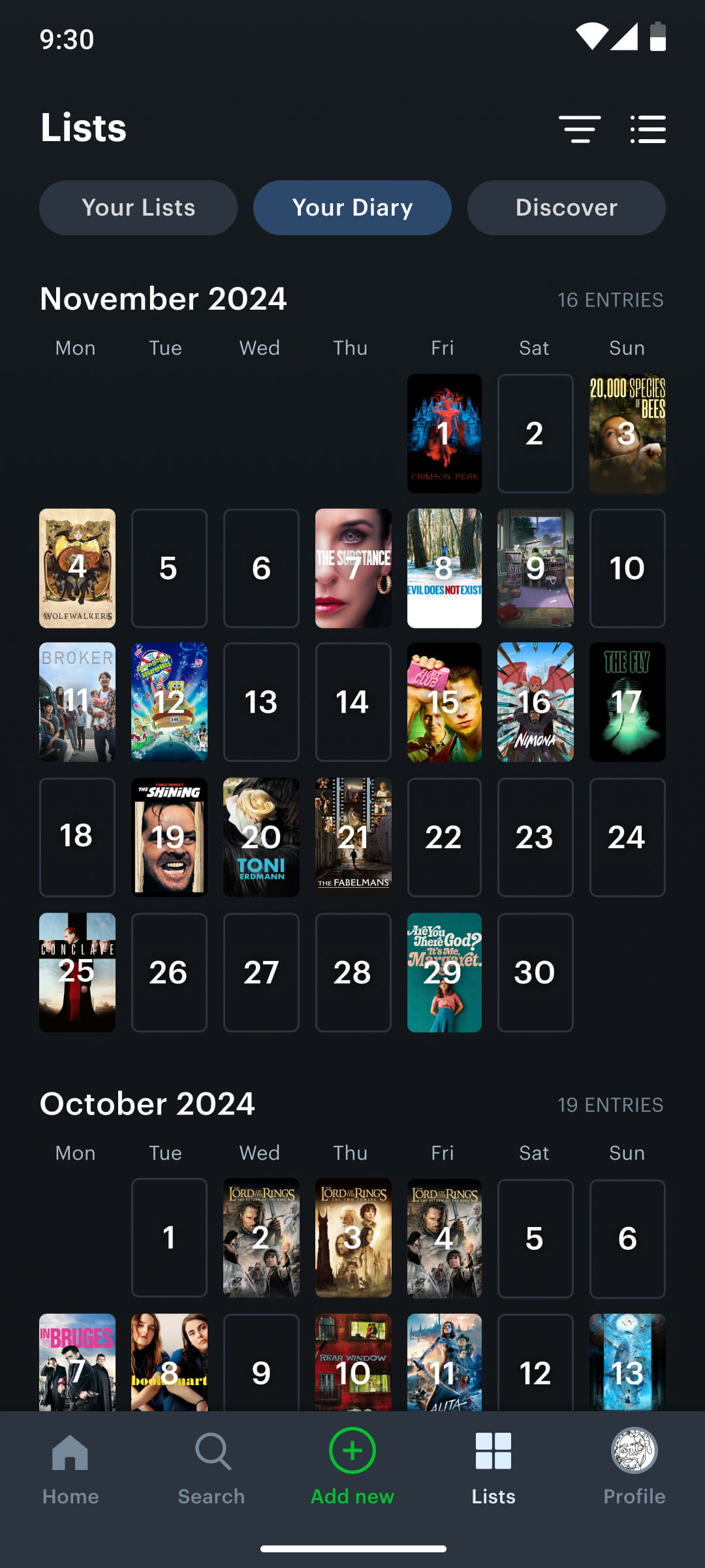
Diary
To provide a more user-friendly and visually appealing presentation of watch history, I integrated a calendar view into the diary screen, showcasing movie posters in a photographic calendar format.
Before
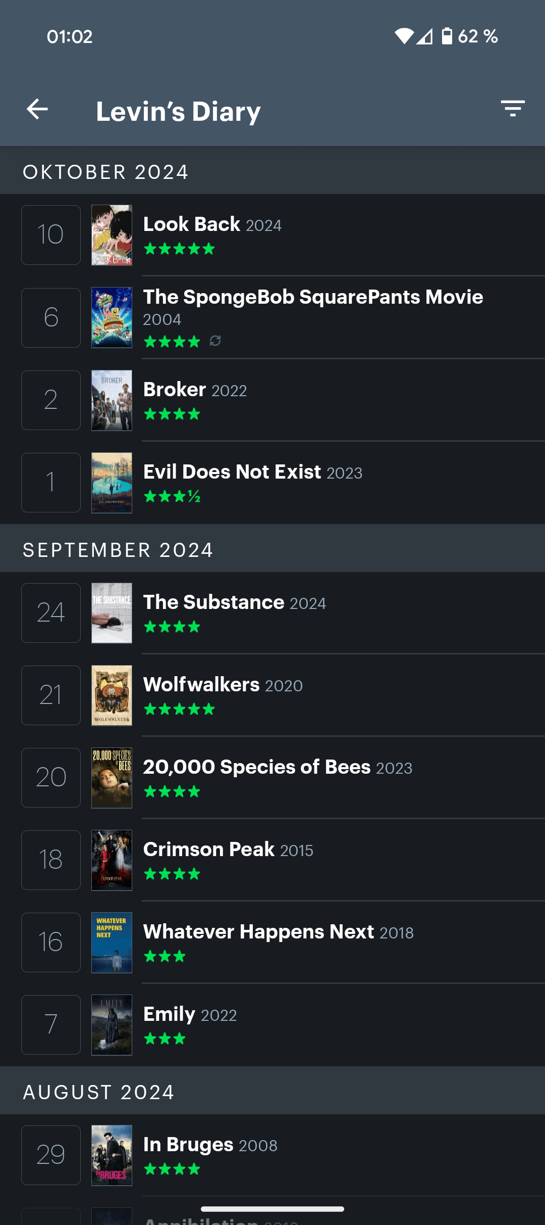
Now
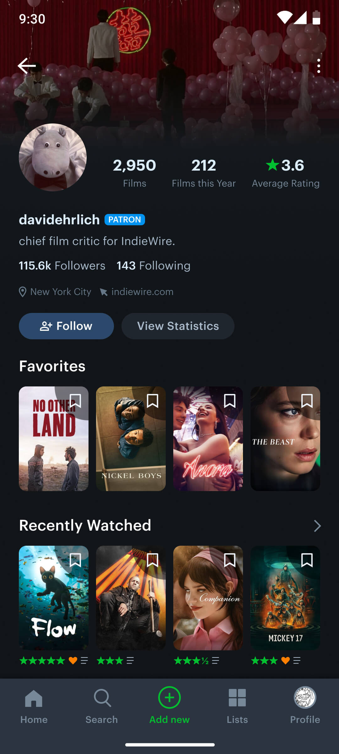
User Profile
Problem: Lack of reading pattern
The user profile suffered from a scattered information layout, disrupting natural reading patterns. As a result, users struggled to effectively focus on critical data points like films watched, following, followers, and average rating, contributing to a sense of information overload.
Redesigning this screen was particularly compelling due to its potential to enhance the app’s social dimension through clear and engaging data visualization.
My Solution:
To optimize data presentation, I curated the top section of the user profile to display only the most essential metrics: total films watched, films watched this year, and average rating, ensuring users quickly grasp key information.
Furthermore, I restructured the user profile to align with contemporary profile page conventions, ensuring a familiar and intuitive user experience.
Old
New
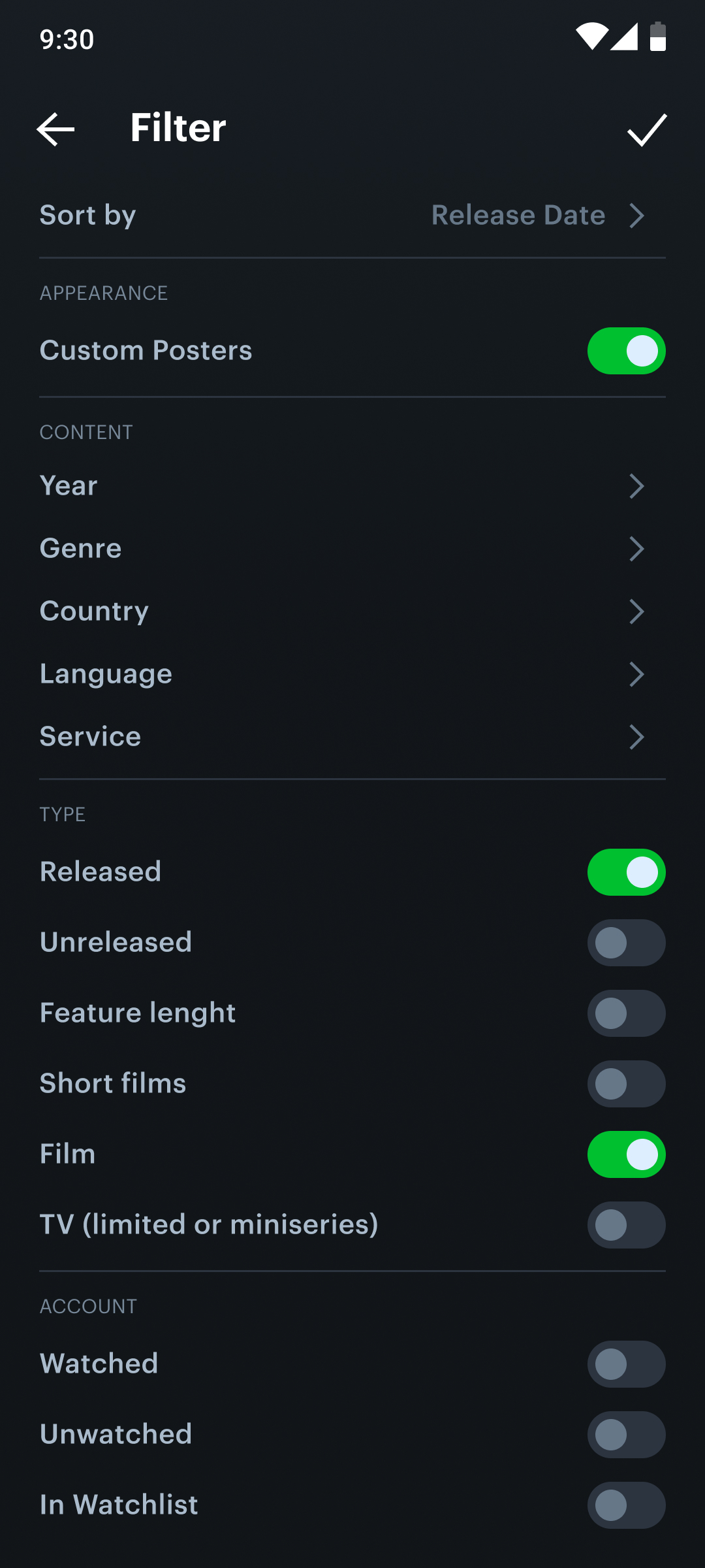
Filter Modal
I optimized the filter modal’s interface for improved user-friendliness, making option selection more straightforward. Additionally, I introduced toggles within the list items to facilitate personalized filtering.
Old
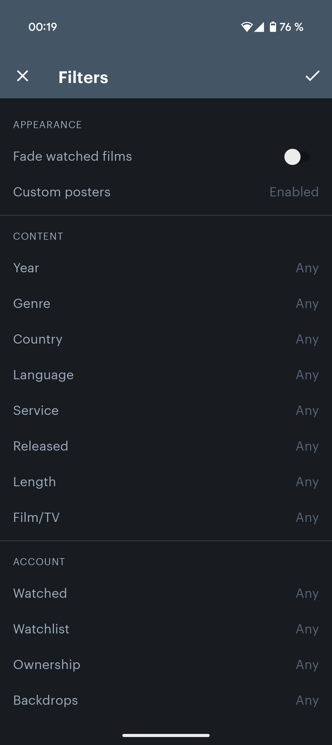
New
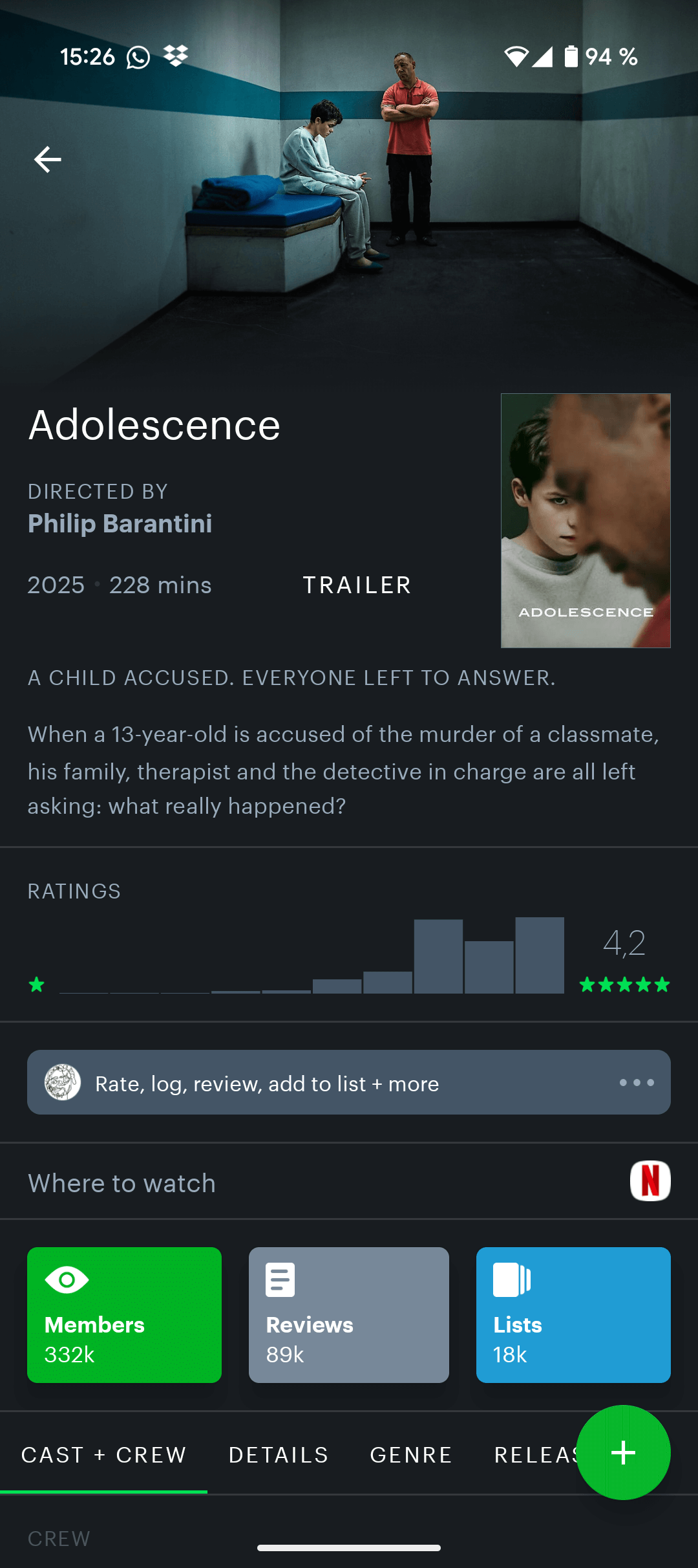
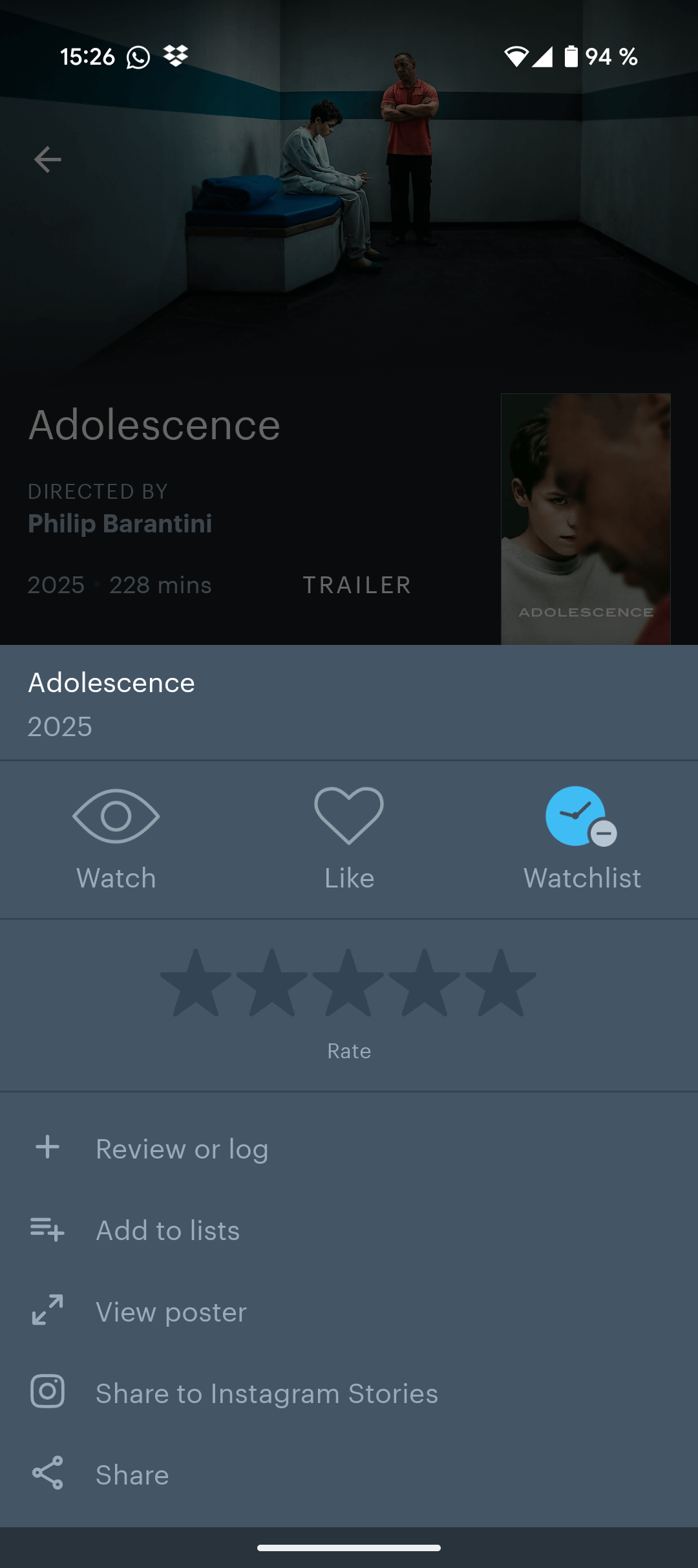
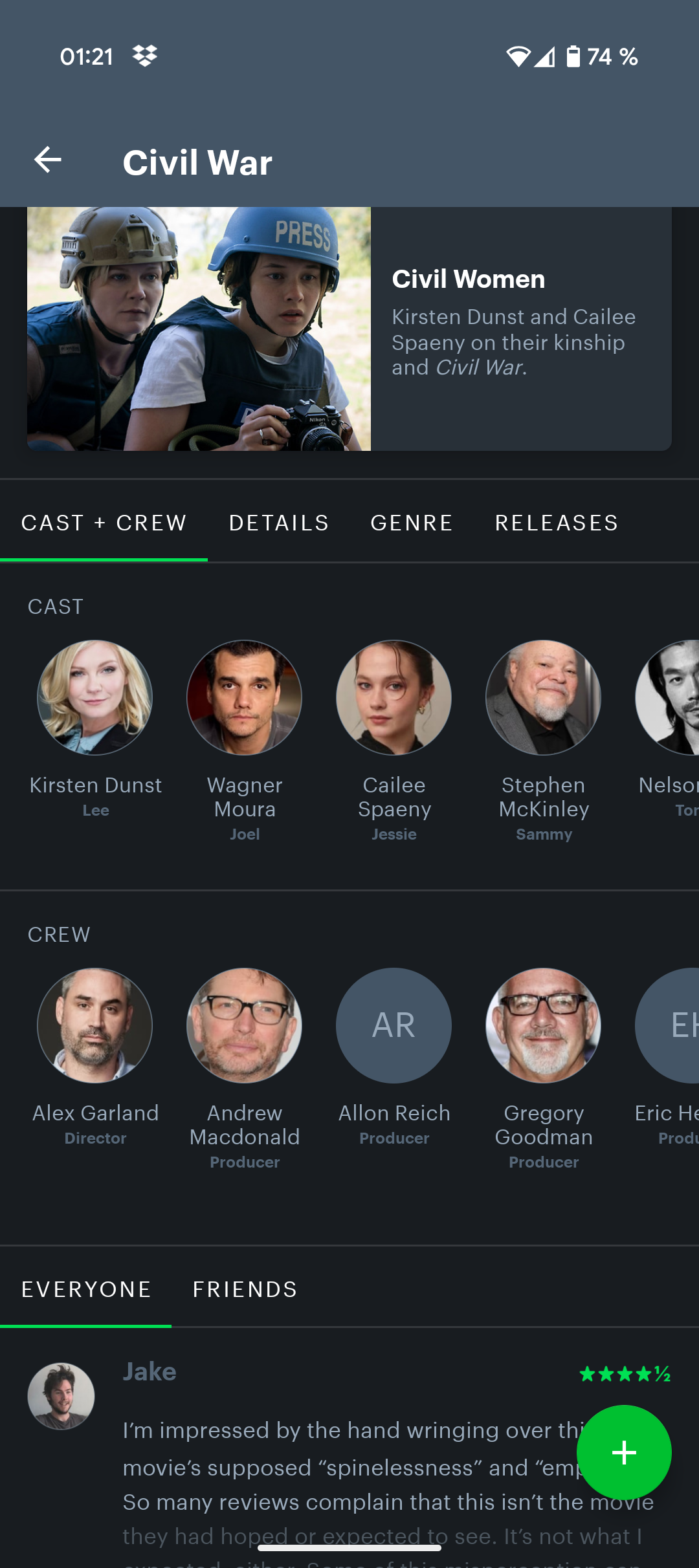
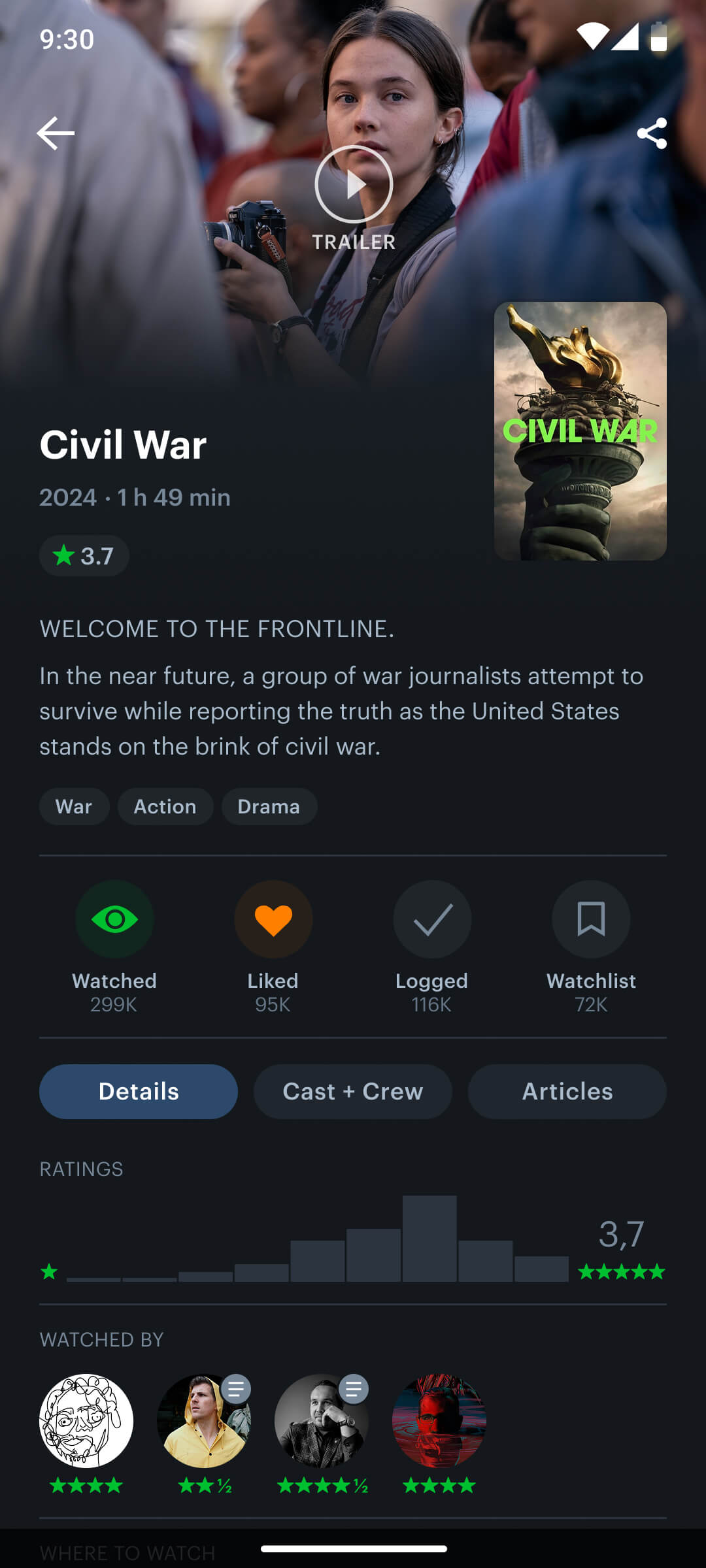
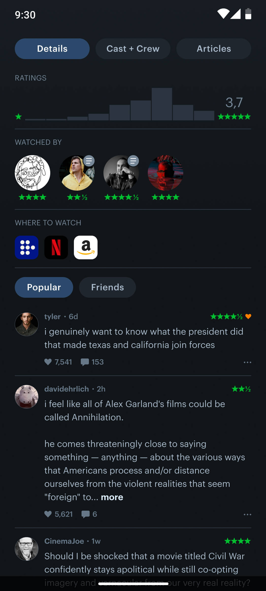
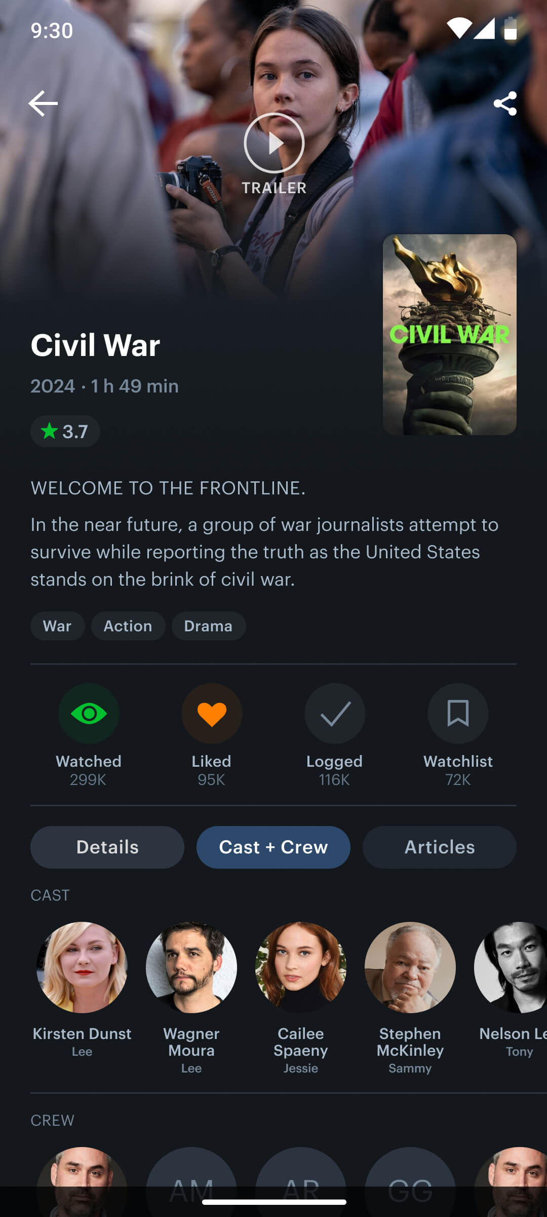
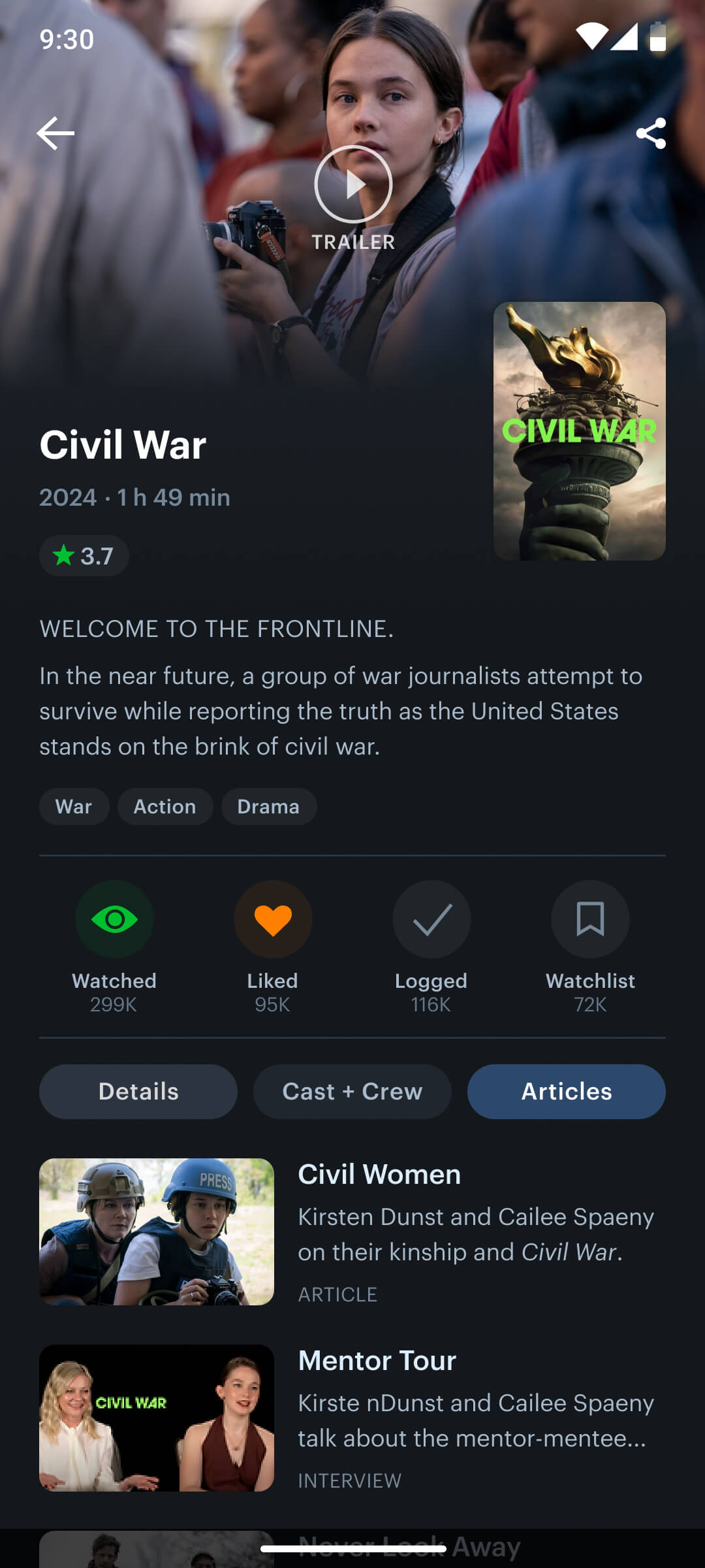
Movie Screen
The movie details screen presented a significant design challenge, requiring extensive iteration on each component to establish a clear information hierarchy and create an engaging user experience. To ensure both familiarity and relevance, I researched popular online movie databases, balancing established patterns with the unique needs of Letterboxd users.
To improve efficiency and user flow, I integrated direct action buttons onto the movie screen for logging, liking, rating, and watch-listing, removing the need for the old modal interface.
Old Movie Screen
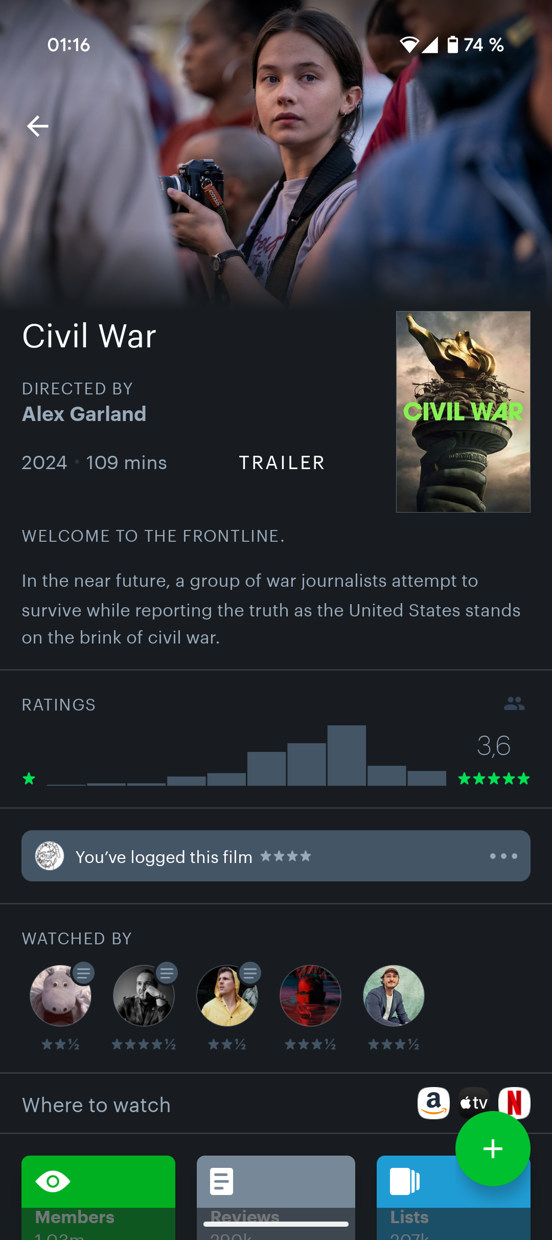
New Movie Screen
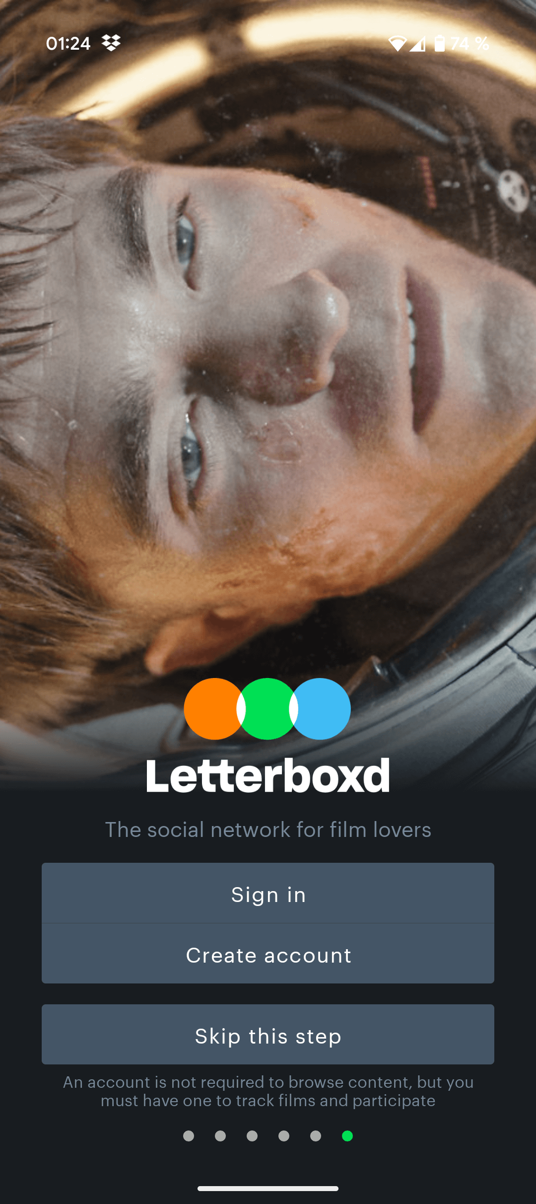
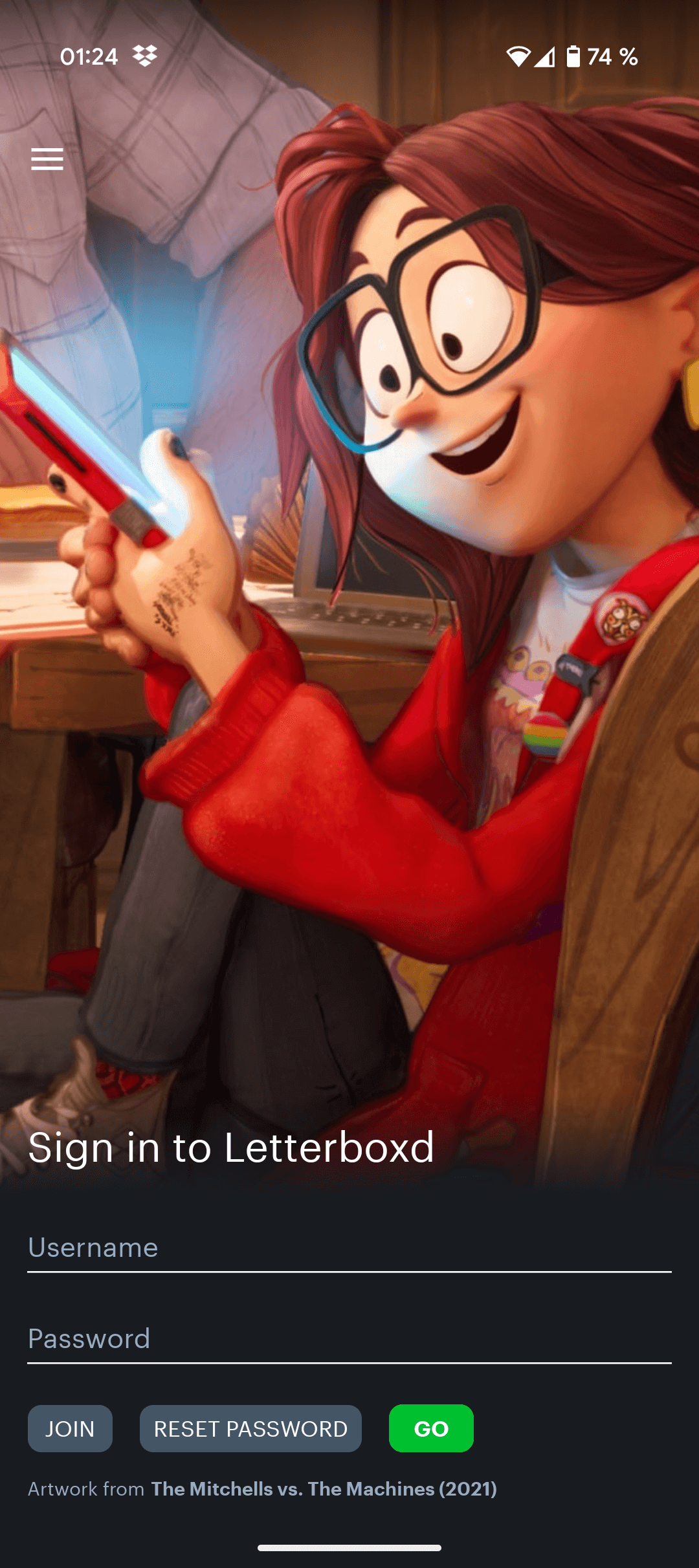
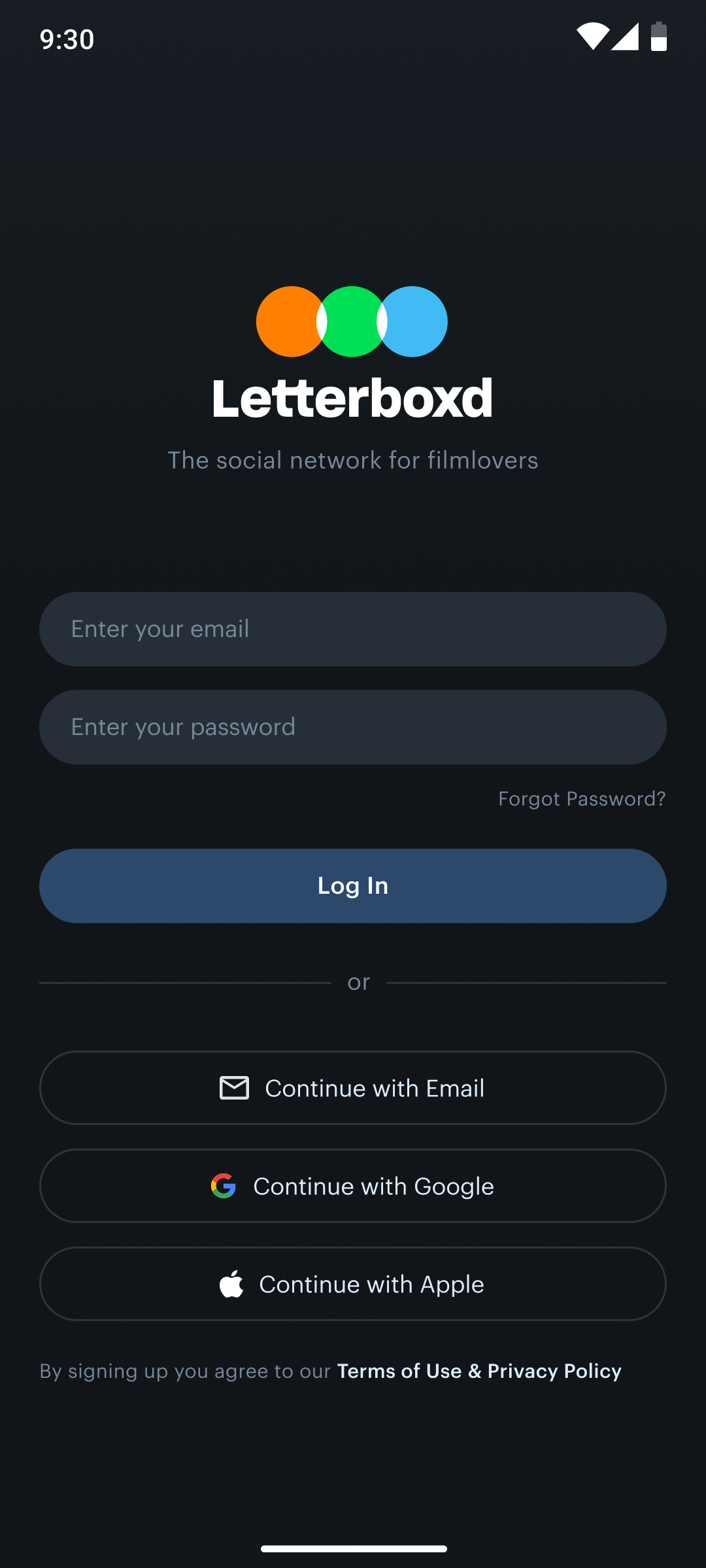
Login Screen
I combined the two login screens from the current design to make a single screen for the new one.
Before
Now
Conclusion
This redesign successfully addressed key user pain points, transforming a frustrating experience into a seamless and enjoyable one. By streamlining navigation, clarifying information hierarchy, and modernizing the UI, I’ve created an app that not only looks better but also functions significantly more effectively. The integration of essential features like genre exploration and personalized recommendations, coupled with the improved accessibility of core functionalities, positions this redesigned app to greatly enhance user satisfaction.
I’m very proud of the outcome and I plan to refine it further when time allows.